5 Visualisation lessons from 2024
Why should you read this? Take this as a bit of a challenge to see whether you think deeply enough about your visualisations. See whether you agree with my top 5, do you have different opinions, do you have your own top 5?
As 2024 came to a close, I looked to summarise my experience with visualisations this year and think about the things that I’ve learnt and will take into 2025.
Simple is difficult

A mentor once asked whether it would be easier to answer the question “Explain the universe” in 10 or 3 marks. They motivated that the 3 mark question was infinitely more difficult because you’d have to decide which things to prioritise.
This illustrates nicely how making something simple can be so difficult. Yet our audiences respond best to simple visualisations that are powerful. Our minds are drawn to simple yet powerful generalisations. In fact, our behavioural nature is wired to make rules (called heuristics) to simplify our thinking.
The challenge is therefore to spend more time on the difficult task of simplifying your visualisations to be powerful. Your audience will appreciate it and you’ll have greater engagement.
Be cautious though, not everything is simple and the audience should be made aware that the simplification might explain the most significant driver but won’t explain all the drivers.
Quality over quantity
At one time I thought there was a correct visualisation, something that could tell the whole story, i.e. the perfect visualisation.
Last year, the lesson for me has been that I am only fooling myself if I think that a visualisation is perfect. This is because perspective really matters, and everyone’s perspective can and will be different.
Good practice to consider whether you want a single focused visualisation or multiple visualisations showing different perspectives. With too many visualisations, you run the risk of the “shotgun” approach, i.e. shooting out many visualisations and hoping one hits the target. So, try to strike a balance with keeping things simple but providing sufficient detail.
Tables vs graphs

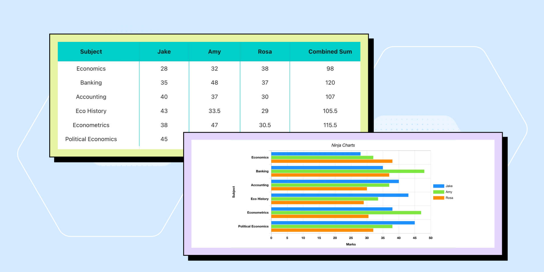
I’m not a fan of data tables. The main reason is that they can appear as a daunting wall of text with the audience needing to spend more time trying to get the highlight from the table.
However, I’ve seen them very effectively being used to provide many different highlights. This can be done through formatting such as heatmaps or through additional annotations in a slide pack/presentation. This should be accompanied by some commentary either in a document or by a speaker.
Tables also provide a benefit over graphs of being able to show data points in numbers which can be a simpler visualisation that adding data labels to a graph. It can also show the neighbourhood of numbers around a data point, e.g. could show temporal as well as data in different categories. For good and bad this gives your audience the power to draw their own comparisons.
Of course, you can strike a middle ground by having a graph to show trends and a table to highlight specific numbers.
Show rather than tell
Visualisation is about showing rather than telling. Your visualisations can summarise large sets of data for your audience allowing you to show them the trends and the key conclusions.
Many machine learning applications aren’t necessarily that easy to visualise but plotting model outputs vs actuals will demonstrate what your model is. Try to see whether the visualisation of a model output matches intuition or whether it produces a new insight that hasn’t been realised before.
Visualisations provide summaries which is an opportunity to show the impressive work that you’ve done in the background rather than just tell your audience about it.
Visualisation isn’t everything

Hoping to solve every communication with a visualisation really misses the mark. You potentially miss out on different learning types that each individual has, you miss out on another potential avenue for engaging your audience and it’s not appropriate for everyone (e.g. you are missing on those who are visually impaired).
To help bridge this gap ensure:
- Your visualisation is accompanied by text or your voice.
- Make your visualisation accessible to those that might be impaired. Could you have a colour scheme that works better, dotted lines, shapes etc.
- Try to make your visualisation part of a story. The combined message is more powerful when all the separate parts come together.
Conclusion
Perhaps I can leave you with some questions:
- What are your visualisation learnings from 2024?
- Are there anything you’d like to try differently in 2025?
- Are you looking to develop your technical skills in 2025?
- Is visualisation something you see as a technical or soft skill?
In summary, visualisations are just a tool to help us engage with people. I hope this top 5 has helped you think more deeply about your visualisations and whether they are helping you to connect and collaborate with others.