All clear: How Shapley values make opaque models more transparents
Originally published by The Actuary, March 2022. © The Institute and Faculty of Actuaries.
Click here to read the original article.
Karol Gawlowksi, Christian Richard and Dylan Liew show how Shapley values can be used to make opaque models more transparent.

It is becoming evident that actuaries will need to embrace and adapt to the age of machine learning. Techniques such as gradient boosting machines (GBM) and neural networks (NN) have been shown to outperform ‘traditional’ generalised linear models (GLMs), but seem to require a trade-off in terms of the model output’s explainability. With actuaries operating under strict frameworks, it is unsurprising that many prefer to use less powerful but more explainable models.
What if we could use models that are both high-performance and interpretable? Techniques are now being developed in explainable artificial intelligence to achieve this. One of the most popular comes from a novel application of game theory, and can explain any type of model.
An opaque model
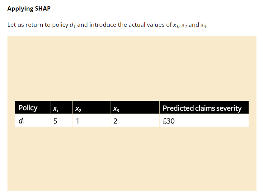
Imagine we have a pricing model that predicts claim severity on a policy and takes variables x1, x2 and x3 as inputs. For policy d1, the model predicts a claim severity of £30. The mean claim severity for this line of business is £20, so the model is suggesting that the values of the inputs add £10 to this policy (above the mean). Policyholder d1 asks what is driving their premium – x1, x2 or x3. What is the cause of this additional £10?
The model uses machine learning such as deep learning or extreme gradient boosting with hundreds of parameters and interaction effects, so we cannot just rely on reading coefficients. We could imagine x1, x2 and x3 as players in a prediction ‘game’ who all want to claim credit for the pay-out value of £10, and consider counterfactual ‘what-if’ scenarios.
Perhaps we remove player x1 and the model predicts a claims severity of £18. Could we then say that when the model only uses variables x2 and x3, it predicts this policy will experience –£2 claims severity compared to the average? Could we also say that x1 adds +£12 expected claims severity to the game? What if x1 is interacting with x2 and x3?
Let’s consider a game (or model) that only uses x1. Perhaps, in this case, £23.50 claim severity is predicted – £3.50 above the mean prediction. Has x1 contributed £12 or £3.50 claims towards the (excess mean) prediction? Is it an average of the two? What about other ways the game can be played?
Considering all variables
Suppose we extend this logic to all possible combinations of parameters the model could use – {x1, x2, x3}, {x2, x3}, {x3}, …. and so on – and then in every possible combination we work out the impact of adding each variable to the prediction (Figure 1).
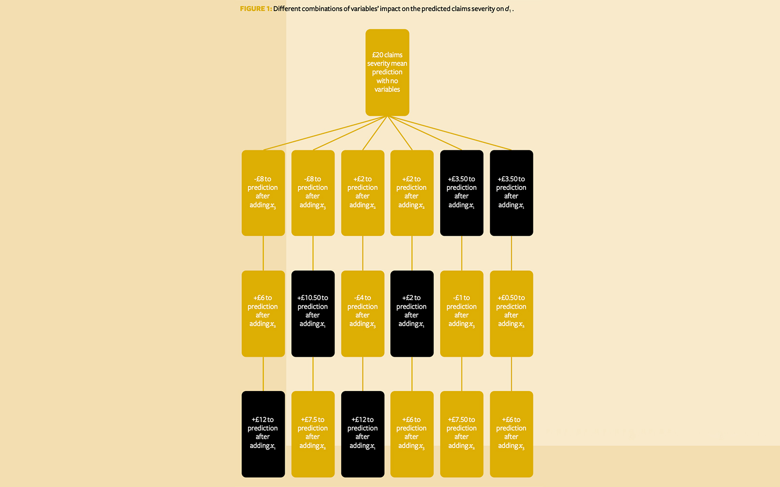
We then consider what each variable has added, on average, to the prediction across all possible scenarios. As Figure 1 shows, the contribution of x1 is
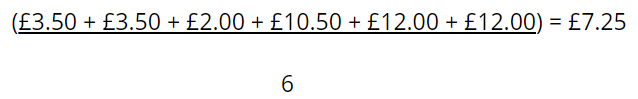
while the contributions of x2 and x3 are £4.25 and -£1.50 respectively.
Why go to all this effort? It can be shown that such an allocation is unique in satisfying several desirable properties all at once:
- It is efficient – in this case, the sum of contributions matches the extra £10 predicted claims severity above the mean (£7.25 + £4.25 – £1.50 = £10).
- It is symmetrical – if two players contribute the same amount to all possible combinations, they will be given the same allocation.
- It allocates zero value to null players (players that don’t contribute anything to any group).
- The allocation is additive when ‘subgames’ are considered.
Such allocations are called ‘Shapley values’ after the economist Lloyd Shapley, who won a Nobel Prize in 2012 for proposing this method.
Shapley Additive exPlanations
A Python package called Shapley Additive exPlanations (SHAP) is a popular implementation used to calculate approximate Shapley values for models.
The example in Figure 1 has only three variables and can be calculated exhaustively, but for a model of n variables we require 2n possible model evaluations. A model with 15 variables would, for example, require 215 (32,768) scenarios. To speed up this calculation, SHAP uses a specific sample of 2n + 2,048 models. With a model of 15 features, only 2,078 models out of 32,768 are calculated.
SHAP prioritises models with very few or very many features, and tends to disregard models with a ‘medium’ amount of features. The idea is that when a model contains very few features (close to 0), adding a new one can tell you a lot about its ‘direct contribution’. However, this is in the absence of other features, so these models tell you little about its interaction effects. Conversely, if a model has, say, p – 1 features, adding the last remaining variable tells you little about its direct contribution but a lot about its interaction contribution, because it is interacting with all possible variables.
In the ‘medium’ case, when a variable is added to a model which contains half its features, it is hard to unpick its direct contribution because it is interacting with other features. It is also hard to unpick its interaction effects, because the model is still missing features. However, SHAP does include a small random sample of some of these models, introducing a stochastic element to its allocations.
SHAP also addresses how to make a prediction when a variable is excluded from the model. Recall that we are trying to explain how a model works. Consider a scenario where the model is missing variable x1. If we rebuild the model without x1, it is no longer the model we’re trying to explain. We need to make sure the model is fixed under every scenario. However, if we build the model with x1, it will need some value for x1 to produce a prediction. Most models cannot take null or missing input. SHAP instead uses a ‘background’ dataset to mimic x1 being missing from the dataset, similar to imputing its value.
If SHAP is required to predict the number of claims without x1, it will first take random samples from x1 with replacement (bootstrapping) – say, 1,000 times. For each of these 1,000 random samples, SHAP is then attached to the same values for x2 and x3 – effectively creating 1,000 new synthetic datapoints (where x2 and x3remain the same but x1 varies). It then uses the model in question and predicts the number of claims for the 1,000 synthetic datapoints – let us call them y0, …. , y1,000.
The average of y0, …. , y1,000 is computed and said to represent what the model predicts when x1 is missing. x1 is treated as behaving almost like a random white noise variable. Notice that this introduces another stochastic element to SHAP, which means results may vary with runs.
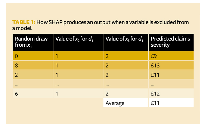
SHAP thus assumes that all features are independent, because the missing features are drawn without varying the features present in the model. In Table 1, x2 and x3 remain fixed for all random values of x1. But what if there is some collinearity and dependency structure between the variables? The synthetic datapoints such as (0,1,2) in the first row may be impossible to observe in the real world, which could lead to model errors in SHAP’s approximation of Shapley values.
Models not included in the sample are not thrown away – their predictions are approximated by linear regression. Going back to a model with 15 features, SHAP fits a line of best fit to the predictions from the 2,078 models included in the sample, to approximate the predictions from the (32,768 – 2,078 =) 30,690 missing models. The coefficients from this linear regression are ultimately used as SHAP’s approximation of Shapley values.
Visualising the model
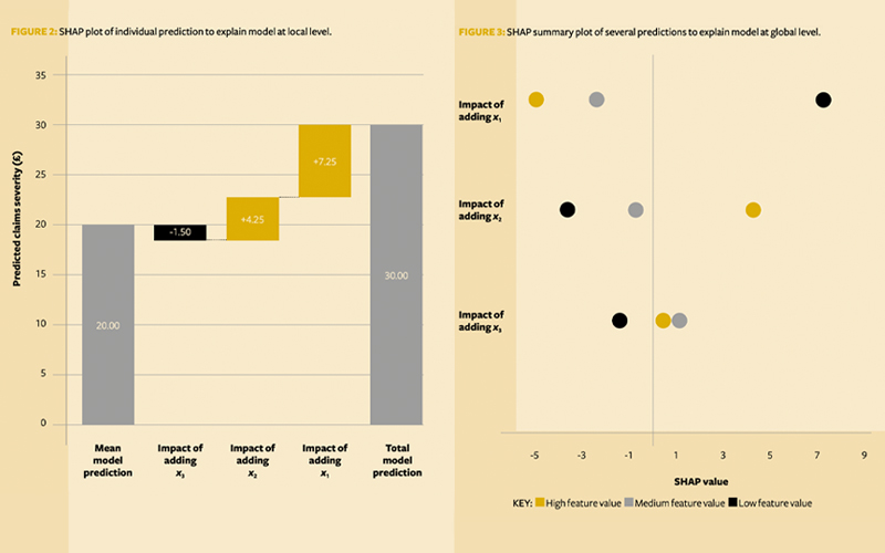
SHAP comes with visualisation tools to aid understanding. Going back to policy d1 and Shapley values of 7.25, 4.25 and -1.5, SHAP often represents these in waterfall type charts (Figure 2).
This shows us that x3has a negative but small impact in producing the predicted 12 claims. x2 has a slightly larger positive impact, but the significant factor is clearly x1.
Suppose we want to explain the predictions of a large portfolio of policies. We could produce separate waterfall charts to examine each of them one by one, but we may miss some big picture effects, and it would take an unfeasible amount of time to review each chart.
To fit all points on the same graph, SHAP:
- Replaces bars with dots (so there’s no overlap with the points)
- Removes the mean model prediction for convenience
- Rotates the graph by 90°
It also colours the points based on their underlying input value.
If we add in two more hypothetical policies (say, d2 and d3), the graph might look like Figure 3. This is known as a SHAP summary plot.
We can infer that x1 seems to drive the predictions up the most – not only for d1 but also for d2 and d3. x2 appears to be second most significant, and x3 doesn’t seem to affect the predictions much.
From the colours, we can see not only that x1 drives up the claims in the model, but also that the lower its value, the higher the predictions. Perhaps the factor is something like policy excess?
Bringing clarity
This method is agnostic to the model being linear, non-linear, GLM, GBM, NN or having any particular form – the same methodology can be applied. SHAP’s ability to consistently unpick and understand any type of model is what makes it so powerful. While there are some limitations and assumptions, it still provides us with model-agnostic universally explainable models that allow actuaries to stop sacrificing model accuracy for interpretability.
Combining the above with other explainable artificial intelligence techniques, such as partial dependency or accumulated local effects plots, could spell the end of GLM. Advanced machine learning techniques can be used with confidence and without fear that the output can’t be explained or understood, and will allow actuaries to adapt to the brave new world of artificial intelligence.
Github repo: github.com/karol-gawlowski/ifoa_sha
Karol Gawlowski is a senior actuarial analyst at AXA XL London
Christian Richard is a life actuary at Zurich International
Dylan Liew is the deputy chair of the IFoA’s Explainable Artificial Intelligence Working Party and a data science actuary at Bupa